

A Guide to Choosing Colors and Logos for Your Brand Kit
Last month we discussed the importance of a brand kit and what components we want to see in a brand kit. This month we’re going to walk through the process of creating your own brand kit, what you’ll want to consider during the process, and where you can look for the various components.
To refresh, a brand kit is what allows your brand to be consistent day to day. Your kit consists of your brand colors, fonts and logos, as well as examples of your brand’s “voice” — the tone you take in communicating for your company, the topics you do and don’t touch, and the types of words and phrases you choose to use.
If you’re creating a brand from scratch, start by brainstorming what you want your brand to convey. Are you looking for playful elegance? Uncompromising quality? A fresh approach? Think about the colors that speak to you, and look up what those colors are generally considered to convey. For example, consider the combinations of colors in the accompanying pallettes.


What do each of these color palettes suggest to you? This will be slightly different for each person depending on their experience, but there are general themes. For me, the red/pink and greens of the first palette suggest a playfulness — the green and pink is reminiscent of saltwater taffy and summertime weeks at the beach, and the red and green suggests holidays and happy experiences. The different shades of green recall plants and the natural world. In the second palette, the primary red, yellow and blue nod to tradition, maybe things that have been done with care for decades or generations. The third palette’s range of greens leans heavily into the natural world, growth and abundance.
Using these color palettes, we’re going to build out logos for a hypothetical farm. What does the Black Thumb Farm logo evoke?
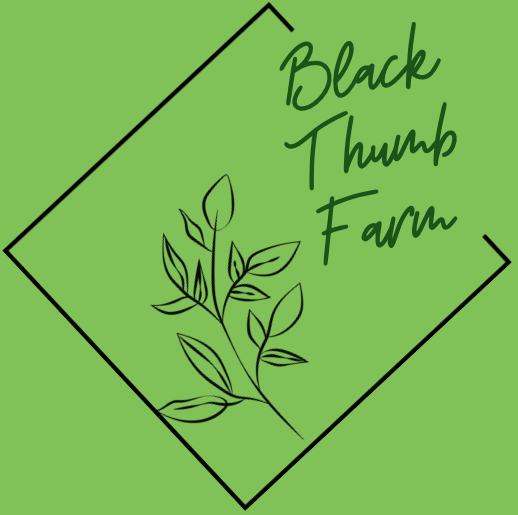
The greens and imagery evoke abundance, right? The contrast of the curve to the square of the border gives the impression of having the ability to adjust, roll with the punches, and be flexible. The font feels like handwriting, and the overall logo gives you an expectation of who’s going to be running this farm. And the name… well, you get the sense that this is a place where fun is welcome! Though you may possibly wonder how long the products you’re buying are going to last… Let’s try it with a different name.

Much better — no nagging doubts here! What happens if we shift to a different font?

OK, is this a Halloween haunted maze? Notice the shift in colors here as well — it definitely feels a bit more ominous.

Let’s change the name again, to Francis Family Farms. The font is a bit more elegant and established than in our first example. You can see that a lot of assumptions have already made, just based on font selection and color scheme.
Moving beyond those examples, let’s use Francis Family Farms to explore another color palette.

Francis Family Farms. Three Fs, perhaps three generations of Francises? This version, with the primary color palette and the overlapping letters, suggests tradition and unity.
At this point I’m just iterating, but the idea is to get you thinking about the assumptions that each of these logos gives you about the farm business being represented. Your logo, your colors, and all of your brand kit communicates assumptions about your farm, and you want to control what those assumptions are.
I’m not a graphic designer — these are all the result of an hour of fooling around in a free design tool. When it comes to building your brand kit, you can hire a designer or take advantage of any of the free online tools to do it yourself. Which you choose is going to depend on how much cash you have on hand, how much you care, and how confident you are in your abilities. Your brand kit shapes the first impressions people will have of your farm, but it’s not the end of the story. Unless your brand actively turns some people off, they’ll continue building their opinion of your farm based on their interactions with you, your staff and your products.
| Conscious Identification with SidesA quick note on controversy. Some businesses these days try to remain as nonpartisan/non-tribal as possible. Other business owners actively embrace causes they believe in and market to specific constituencies. Either strategy can work; you just have to navigate the latter course of action carefully. For example, I have a friend, Alejandra Luaces, who is unabashedly liberal and has built a bakery, Hell Yeah Gluten Free, where her personal opinions fit right into the company ethos. The name sets a very different expectation than Heck Yeah Gluten Free, or Everything Gluten Free. It sets the tone of Alejandra’s company — it’s playful and irreverent, with bright colors, sparkles and occasional blue iced donuts to fundraise for Democratic candidates. This is the polar opposite of the branding of a company like, for instance, Black Rifle Coffee Company. Many other businesses attempt to remain as neutral as possible.This isn’t to say that you shouldn’t incorporate controversy into your branding; just be intentional whether you choose to do so, and put the majority of your energy into growing a high-quality product. |
So, where can you turn to build your brand kit once you’ve done some brainstorming around what you want your brand to convey? There are a lot of good services that have free trials or are free outright. Canva tends to be my favorite, but you can play around with Adobe Spark, Looka, Snappa or VistaCreate. If you’d rather hire someone, try your luck with Fiverr or Designhill. Or just reach out to your network — chances are you know someone who has some design experience and would be able to help you.
If you’re going to work with someone on your brand kit, the best thing you can do to prepare is to be clear on what you want to convey. You’ll likely go through multiple iterations of your kit, both when you’re establishing it and as your farm evolves.
To recap, your brand is the first thing someone new to your farm will interact with. From the colors you use in your logo to the fonts on your signage, you should have a consistent presence across online and offline platforms, and you should keep all the details of that presence up to date in a brand kit. Colors, lines and shapes all suggest different emotions, and the choices you make will be the first impression people have of your farm. Even if you don’t sell direct to consumer, if your products interact with people during the sales process, you’ll be well served by taking some time to decide on and document your branding.
Kirsten Simmons is the co-founder and Chief Farming Officer for Good Agriculture (goodagriculture.com), a company dedicated to helping farmers find funding, manage finances, reach new customers and get certified. She also farms at Ecosystem Farm in Atlanta (ecosystemfarm.com).